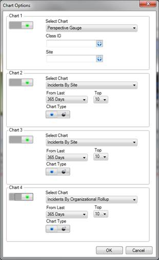
The four pre-set charts on the Dashboard give you a quick overview of trends found in the Perspective database records you have access to. To select the combination of up to four charts for display on the Dashboard, follow the steps described below.
1. Click the Chart Options button on the Navigation pane.
2. In the Chart Settings window, click on the ON/OFF 
 switch to display or hide one of the chart sections.
3. Within the relevant chart field (e.g., Chart 1), choose the chart you would like to appear in the selected chart section (e.g., Incident by Class).
4. Depending on the chart specified, a number of further settings will be displayed, which may (or may not) include the following:
· From Last: Select the time period for which you would like to see the statistics on the chart (e.g., 365 days).
· Top: Specify the number of categories you would like to display on your chart (e.g., top 10 classes).
· Call Category: Restrict your data to a specific Call Category, making it as narrow as necessary. Click the plus icon  next to the Call Category field, and select the requirednumber of levels of category by which you would like to restrict the data in the chart.
· Class ID: Restrict your data to a specific Class, making it as narrow as necessary. Click the plus icon next to the Class ID field, and select the required number of class levels (i.e., Class/Category/Subcategory/Type) by which you would like to restrict the data in the chart.
· Site: Restrict your data to a specific Site, making it as detailed as necessary. Click the plus icon next to the Site field, and select the required number of site levels (i.e., Site/Building/Location/Section) by which you would like to restrict the data in the chart.
· Category ID: Restrict the Case data in your chart to either Internal or External cases.
· Year: Select the specific year you want to display your data for (e.g., 2011)
· Chart Type: Choose either the pie or bar chart type.
5. Click OK to see the results displayed on the Dashboard.
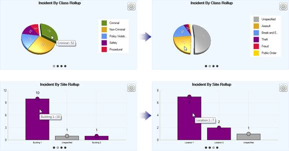
6. At any time, you may change the chart options for each individual chart displayed on the Dashboard by clicking the corresponding Settings icon  .
.
· This will open the options window for the chart that you chose to modify.
7. Examine one particular chart in detail by clicking the Maximize icon  in the upper right corner of the relevant chart section. To dock it back together with the rest of the charts, click the equivalent Minimize icon
  .
.
8. If the chart you selected is either a uni-coloured bar chart or a pie chart, you may be able to explore the information contained in the chart further. By clicking on a bar or a pie sector that corresponds to a specific category, class, organization, or site, you may expand the data that is hierarchically subordinate to the data currently displayed on the screen. For example, if you are viewing the Incident By Class chart, you may click on the green pie sector that corresponds to the Criminal class of incidents to open a pie chart for all incidents contained under the Criminal class (e.g., Assault, Theft, Fraud). To explore the data even further, you may click on the yellow pie sector that corresponds to the Assault category of incidents.
The number of subordinate charts corresponds to the number of tiers under the corresponding rollup (in our example, the Class Rollup). To navigate within the hierarchy, click on one of the dark gray circle icons displayed below the chart. Each circle represents one tier of the rollup, in ascending order.
9. To copy a chart image, right-click the chart and select Copy to Clipboard.