This object is used to evaluate and display data graphically in diagrams. This gives you an overview of your data and lets you recognize anomalies immediately.
For example, you can analyze sales trends, illustrate percentage shares and show data in multiple dimensions. You have a wide range of different types of diagrams at your disposal:
· Circle/Donut chart
· Bar/Ribbon chart (also displayed as cylinders, pyramids, cones, octahedrons)
§ Simple (e.g., sales per customer)
§ Multi-row (e.g., sales to various customers over the years, scaled by customer)
§ Clustered (e.g., sales to various customers over the years, grouped by year)
§ Stacked (e.g., percentage of sales to various customers stacked over the years)
§ 100% stacked (e.g., respective sales percentages for various customers over the years)
· Line/Symbol: Simple, Multi-row, Stacked, 100% stacked
· Area: Simple, Stacked, 100% Stacked
· Bubbles/Dots: Distributed, Sorted (Displayed as circle, drop or picture file)
· Funnel/Pipeline
· Map/Shapefile
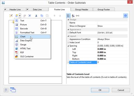
Insert a Chart Object
There are various ways of outputting chart objects:
1. A chart as an element in the report container. Add the object via the Report Structure tool window. If you have not yet added a report container to the workspace, select Insert > Report Container (Objects > Insert > Report Container) and pull the object to the right size in the workspace while holding down the left mouse button. A selection dialog will appear for the chosen element type. Choose the Chart element type.
2. You can output charts and gauges in a table cell. To do this, select the relevant entry by means of the context menu in the object dialog for the table. If you want to output the aggregated data, a good way of doing this is to use a footer line.
3. In the following dialog, now select the data source. All available tables are shown hierarchically, in other words, under the tables you will find the relational tables in each case.
To evaluate sales per country, for example, choose the Customers > Orders > Order Details table in the Sample Application so that you have all three tables at your disposal. The Customers table contains the country, the Orders table the order date and the Order_Details table the sales.
4. The chart object dialog is displayed. In the drop down lists in the top left you can select the base type and the corresponding sub type.
5. The axes are defined in the tabs (Category Axis, Series Axis, Value Axis, Data Source, Segment, Funnel Segment, Shapefile Selection). You can click directly into the live preview (e.g., onto the title or axis label) to quickly jump to the corresponding property.
6. On the Diagram tab, select the general diagram options (e.g., perspective, color mode).
7. On the Object tab, select the general layout options for the entire chart object (e.g., Title, Background).
8. On the Colors tab, you can specify the colors for the display:
· Design Scheme: Specifies the colors and color sequences for the data rows that are not specified by the Fixed Colors. You can select a predefined color set from the drop down list. These colors can still be adjusted in the properties.
· Fixed Colors: You can assign fixed colors to particular axis values. If you click the New button, you can create a new assignment e.g., Customers.Country = Germany.
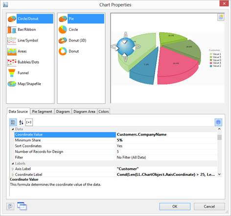
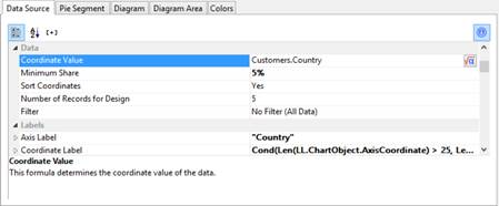
Pie, Donut, or Circle Chart
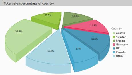
Let's assume that you want to evaluate the sales per country. The pie chart is the right choice for this. It lets you read off the percentages immediately. Proceed as follows in the Sample Application:
1. As the data source, select the Customers > Orders > Order_Details table.
2. For the diagram type, click Circle/Donut > Pie.
3. You should first specify the coordinate values for the data source, i.e., the values that define the individual segments, e.g,. Customers.Country.
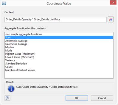
4. Switch to the Segment tab to specify the coordinate values for size of the segment, i.e., the sales. Double-click the Coordinate Value property.
Now select the aggregate function that you want for the contents in the Coordinate Value dialog that follows. You want to create a sales evaluation so choose the Sum function.
5. In the upper part of the dialog, you can specify the contents by clicking the formula button to start the formula wizard. In the Sample Application, the sales per order value is not supplied directly as a field so you must calculate it using the Order_Details.Quantity * Order_Details.UnitPrice formula.
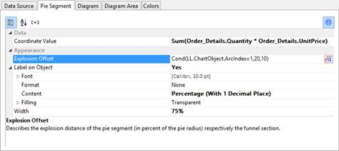
6. The Label on Object property is already set to Yes so that a label with the percentage value is shown on the segments. Define the value as percent without decimal places by means of the Format property.
7. The Explosion Offset property lets you specify a distance to the center for the segment. With the ArcIndex chart field, which numbers the segments according to their size, you can even display the largest segment with a greater offset. Example:
Cond (LL.ChartObject.ArcIndex=1,20,10)
8. On the Diagram tab, select the general diagram options. Various properties are available including:
· The degree of perspective, e.g., strong.
· The color mode, e.g., single color
9. On the Diagram Area tab, select the general layout options for the entire chart object. Various properties are available for this including:
· Title
· Background including filling, border and shadow, e.g., border = transparent
10. On the Colors tab, you can specify the colors for the display:
· Design Scheme: Specifies the colors and color sequences for the data rows that are not specified by the Fixed Colors. You can select a predefined color set from the drop down list. These colors can still be adjusted in the properties.
· Fixed Colors: You can assign fixed colors to particular axis values. If you click the New button, you can create a new assignment e.g., Customers.Country = Germany.
11. The pie chart now looks like this:
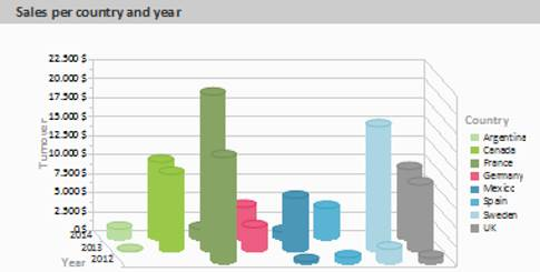
Multi-Row Bar Chart
Let's assume that you want to evaluate the sales for various countries over the years, scaled by country. A multi row bar chart is perfect for this. You get a diagram in which you can see the turnover achieved in the respective country for each quarter. Proceed as follows in the Sample Application:
1. As the data source, select the Customers > Orders > Order_Details table.
2. Choose Bar/Ribbon > Multi-Row (3D) as the diagram type.
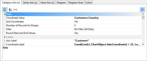
3. First specify the coordinate value for the category axis, i.e., the value of the x-axis. Select the Customers.Country field via the formula wizard.
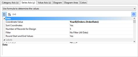
4. Now specify the coordinate value for the series axis, i.e., the value of the y-axis. In the Sample Application, the order year is not supplied directly as a field so you must calculate it using the Year$(Orders.OrderDate) formula.
If you want to evaluate the data by year, simply enter Year$(Orders.OrderDate) as the coordinate value. Type Year as the text for the Axis Label.
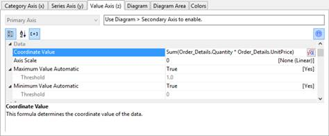
5. Now specify the coordinate values for the value axis (z-axis), i.e., the height of the bars representing the turnover. Double-click the Coordinate Value property.
Now select the aggregate function that you want for the contents in the Coordinate Value dialog that follows. You want to create a sales evaluation so choose the Sum function.
6. In the upper part of the dialog, you can specify the contents by clicking the formula button to invoke the formula wizard. In the Sample Application, the sales per order value is not supplied directly as a field so you must calculate it using the Order_Details.Quantity * Order_Details.UnitPrice formula.
7. Various other properties are available on this tab including the following layout options:
· Maximum Value Automatic: You can limit the height of the displayed area, e.g., to cater for anomalies.
· Presentation: The data can be presented in various ways: cylinders, bars, pyramids, ribbons, octahedrons, cones
· Thickness of the bars
· Zebra mode for the background
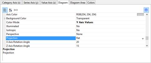
8. On the Diagram tab, select the general diagram options. Various properties are available including:
· The Projection, e.g., flat.
· Color Mode: Specifies which axis determines the color, e.g., the y-axis values.
9. On the Diagram Area tab, select the general layout options for the entire diagram. Various properties are available for this including:
· Title
· Background including filling, border and shadow, e.g., border = transparent
10. The multi-row bar chart now looks like this:
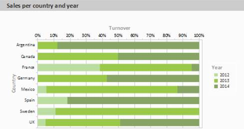
100% Stacked Bar Chart
The pie chart in the first example gave you an overview of the percentages for the entire evaluation period. But in order to be able to recognize trends, it would be good to see how the percentages have changed during the course of the evaluation period. The 100% stacked bar chart can be used for precisely these types of applications. The respective percentage of the length of the bars relates directly to the turnover percentage of the respective country.
Proceed as follows in the Sample Application:
1. As the data source, select the Customers > Orders > Order_Details table.
2. Choose Bar/Ribbon > 100% stacked as the diagram type.
3. First specify the coordinate values for the category axis, i.e., the values of the x-axis. Select the Customers.Country field via the formula wizard.
4. Now specify the coordinate values for the series axis, i.e., the values of the y-axis. In the Sample Application, the order year is not supplied directly as a field so you must calculate it using the Year$(Orders.OrderDate) formula.
5. Specify the coordinate values for the value axis (z-axis), i.e., calculate the turnover with Sum(Order_Details.Quantity * Order_Details.UnitPrice).
6. On the Diagram tab, choose Left to Right for the Alignment to create a horizontal diagram.
7. The multi-row bar chart now looks like this:
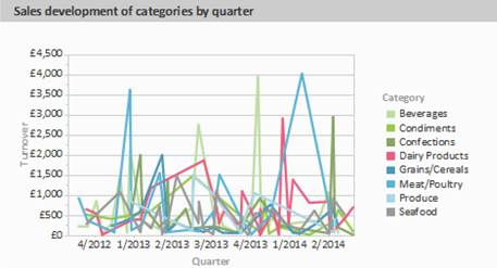
Multi-Row Line Chart
A line diagram offers an alternative to a multi-row bar chart. You can read off the values faster here.
Proceed as follows in the Sample Application:
1. As the data source, select the Customers > Orders > Order_Details table.
2. Choose Line/Symbol > Multi-Row as the diagram type.
3. First specify the coordinate value for the category axis. Select the Orders.OrderDate field via
the formula wizard.
4. Select the property Coordinate Label > Format and select %q/%y in the Date-section (user-defined).
5. Now specify the coordinate value for the series axis. Select the CategoryName field via the formula wizard.
6. Specify the coordinate values for the value axis and calculate the turnover with the Sum(Order_Details.Quantity * Order_Details.UnitPrice) formula.
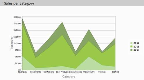
Stacked Area Chart
The stacked area chart is available as an alternative to the multi row line chart. This chart allows you to compare statistical relationships more swiftly as the areas between the lines are colored in.
Proceed as follows in the Sample Application:
1. Select the Customers > Orders > Order Details table as the data source.
2. Select Area > Stacked as the chart type
3. First specify the coordinate value for the category axis. Select the CategoryName field via the formula wizard.
4. Specify the coordinate values for the series axis. In the Sample Application, the order year is not supplied directly as a field, so you must calculate it using the Year$(Orders.OrderDate) formula.
5. Specify the coordinate values for the value axis (z-axis), i.e., calculate the turnover with the Sum(Order_Details.Quantity * Order_Details.UnitPrice) formula.
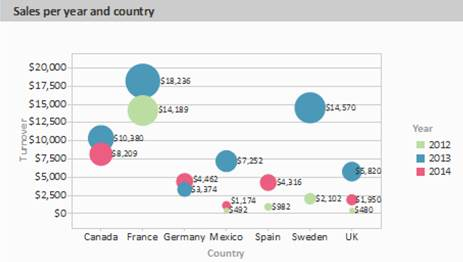
Distributed Bubble Chart
Bubble charts allow for a four-dimensional representation of statistics in that, along with the position on the y and x axes, the color and the size can be defined by statistical information. Diverse options are available regarding how you would like the bubbles to be displayed.
Proceed as follows in the Sample Application:
1. Select the Customers > Orders > Order Details table as the data source.
2. Select Bubbles/Dots > Distributed as the chart type
3. First specify the coordinate value for the category axis. Select the Customers.Country field via the formula wizard.
4. Specify the coordinate values for the series axis. In the Sample Application, the order year is not supplied directly as a field so you must calculate it using the Year$(Orders.OrderDate formula.
5. Specify the coordinate value for the value axis and the value for the Bubble Size and calculate for both the turnover with the Sum(Order_Details.Quantity * Order_Details.UnitPrice) formula.
6. Under this tab you will also find the options for how you would like the bubbles to appear.
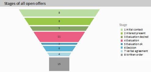
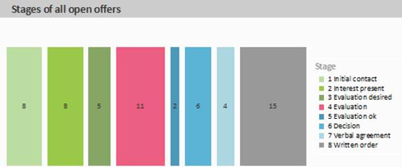
Funnel
With a funnel or a pipeline, you can e.g., display your sales processes in the various phases. There are a variety of options for the way the data is presented.
To do so, proceed as follows:
1. Select the appropriate data source.
2. As the diagram type, select Funnel > Vertical Funnel.
3. First of all, define the coordinate value of the data source, i.e., the value that will define the individual funnel segments (the sales phase).
4. Switch to the tab Funnel Segment to define the coordinate value for the size of the funnel segment (number of sales opportunities). Double-click on the Coordinate Value property. Now, in the subsequent dialog Coordinate Value, select the desired aggregating function Count for the content.
5. For the labeling of the funnel segments with percentage values, the option Label on Object has already been set to Yes. Then, via the property Format, define the value as Percentage (Without Decimal Places) or as Absolute Value.
6. You can enter an offset for the funnel values via the property Explosion Offset.
7. In the Chart tab, select the general diagram options. The following properties are available (among others):
· Relative Width of Funnel End/Start.
· Color Mode, e.g., monochrome
8. In the Chart tab, select the general layout options of the entire object. The following properties are available (among others):
· Title
· Background incl. filling, border and shadow, e.g., border = transparent
9. In the Colors tab, you can configure the color options.
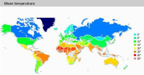
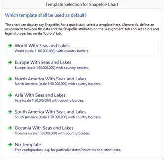
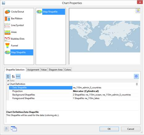
Map/Shapefile
Shapefiles enable a diverse range of visualization options via a standardized vector description format. Via corresponding templates, a wide range of maps, seating charts or floor plans can be generated. The Shapefile determines the shape, and an associated attribute database enables the shapes to be referenced to the properties (e.g., country names).
Tip: The availability of this chart depends on the application.
To do so, proceed as follows:
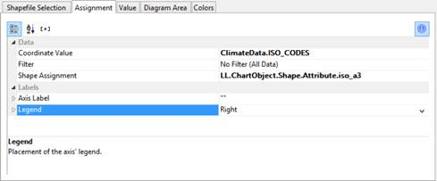
1. Select the table ClimateData as the data source.
2. As the diagram type, select Map/Shapefile. At this point, a selection dialog appears for the Shapefile templates provided with the software. Select World With Seas and Lakes.
3. You will now see the preconfigured data Shapefile in the tab Shapefile Selection. In addition to the data itself, you can also select foreground and background Shapefiles in order to e.g., display the oceans in the background and the rivers and lakes in the foreground.
4. Click on the Assignment tab in order to link the data with the shapes.
Link the coordinate value ISO_CODES from the data with the attribute iso_a3 from the Shapefile. By doing this, the data that is related to e.g., USA is linked to the outline of USA; the temperature from United States of America is linked to United States of America, and so on.
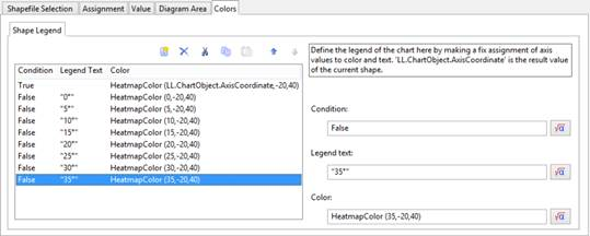
5. Go to the tab Value and select the mean temperature as the Value, i.e., the field ClimateData.Tmean.
6. Go to the tab Colors to define the legend. As the first entry, define the color via the function HeatmapColor(LL.ChartObject.AxisCoordinate,-20,40) and set the condition to True. The value will then be used for the actual color fill, and you will obtain a continuous fill color.
7. For the other discrete legend values, enter the corresponding functions, e.g., HeatmapColor(5,-20,40) with the legend text 5° and set their condition to False. This means that the value will only be used for the legend.
Use Series to Determine the Values
With three-axis diagrams, you can also determine the values of the series axis (y-axis) by means of rows. This means that you define the different rows (e.g., measured value/target value/actual value) with a single data record and can show them parallel e.g., in a bar chart.
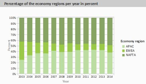
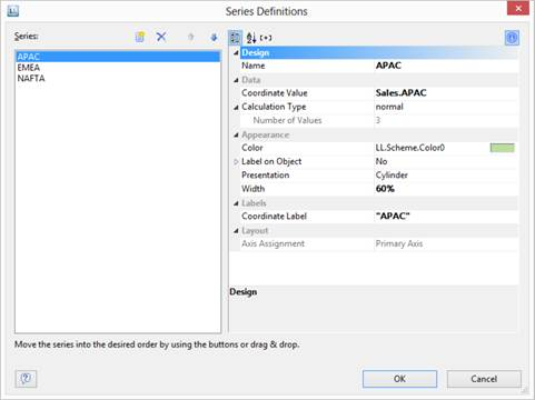
As an example, we will create a diagram which shows the currency percentages of the 3 economic areas. Data for APAC, EMEA and NAFTA is supplied as rows.
Proceed as follows in the Sample Application:
1. Select the Sales table as the data source.
2. Choose Bar/Ribbon > 100% stacked as the diagram type.
3. First specify the coordinate values for the category axis, i.e., the values of the x-axis. Select the Sales.Year field with the formula wizard. Remove the 2 decimal places using the Str$(Sales.Year,0,0) formula.
4. Now specify the coordinate values for the series axis, i.e., the values of the y-axis. Select the Use rows as data source entry from the drop-down list above the properties.
This option changes the properties of the series axis and displays a dialog for defining the rows when you click the Row Definitions property. Create the individual rows choosing Sales.APAC, Sales.EMEA or Sales.NAFTA in each case as the coordinate value.
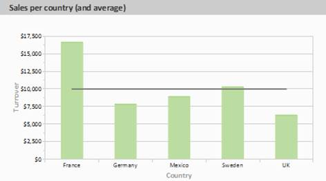
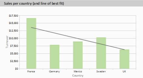
Mixing Chart Types
You can mix bar charts with line charts. In addition to the ability to display another data series as a line at the same time as the bar chart, you may also make use of the calculation options such as moving averages and aggregation options. This will allow you to see total turnover, trends in the data, or outliers (both upwards and downwards) at a glance.
1. Select the table Customers > Orders > Order Details as the data source.
2. As the diagram type, select Bar/Ribbon > Clustered
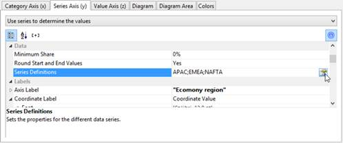
3. First, define the coordinate value of the category axis. Use the formula assistant to select the field Customers.Country.
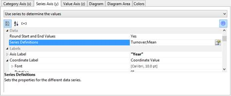
Now define the coordinate value of the series axis. Use the combo box above the property list to select the entry Use series to determine the values.
By doing this, the properties of the series axes change and a dialog appears for the property Series Definitions for the definition of the series.
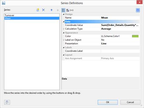
4. Define a new series Single Turnover and calculate the turnover using the formula Sum(Order_Details.Quantity * Order_Details.UnitPrice) with the calculation type normal and display type Cylinder.
5. Define another series named Mean and calculate the turnover using the formula Sum(Order_Details.Quantity * Order_Details.UnitPrice) with the calculation type Average and display type Line.
6. The result is a turnover analysis with a mean line.
7. When using the calculation type Line of best fit, a trend line will be displayed: