The table section of Analyze Results is where you decide what to analyze and how you want it to be displayed.
1. In the Navigation pane, open the Analyze and Report module.
2. From Analysis Expert, choose the query record that you want to view. To execute the query, do one of the following:
· Click Execute  on the Ribbon.
· Right-click in the listing pane, and select Execute from the drop-down menu that appears.
3. If you have user rights, you may make modifications to the Value field in the window that appears. Then click the Execute  button.
4. Click the Analyze Results  button.
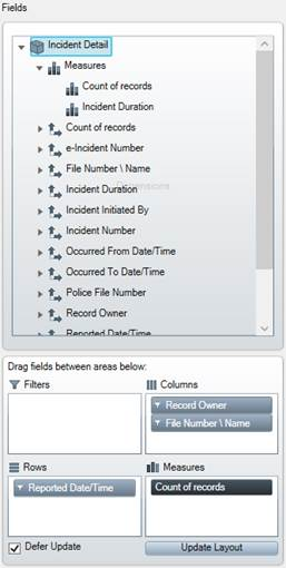
5. The Analyze Results window will open. By default, you will be in the Show as Table tab. From here, you can begin organizing and filtering your data into a table.
6. Choose the variables you want to see displayed in your table by dragging them from the Fields section into the Filters, Columns, Rows, or Measures windows.
· Filters: Allows you to limit the data you see by filtering out the fields you don’t want displayed. Select the variables you want to filter by.
Note: You can change the variables on the Tables, Data Charts, and Pie Charts tab.
· Columns: Organizes the selected fields into columns.
· Rows: Organizes the selected fields into rows.
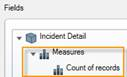
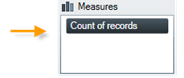
· Measures: Shows a count of the data you want displayed.
Note: Selecting the Defer Update checkbox will prevent your data from automatically being shown on your screen. If this checkbox is selected, you will have to click the Update Layout button whenever you want to see a current display of your data.
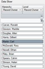
7. Once you have selected the data you want to appear in the table, you can dig deeper by using the Data Slicer to narrow or expand your results by hierarchy and level.
· Once you have decided how you want to slice your data, click on the specific hierarchy and level you want to view.
Note: To hide the hierarchy and level drop-down menus, click the  button. To bring it back into view, click the
  button. Additionally, if you want to reset the hierarchy and level, click the
  button.
Note: You can hide the Data Slicer section of Analyze Results by clicking the  button, found in the top left corner of the Analyze Results window. Click the
  button to bring the Data Slicer back into view.
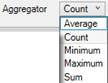
8. To show different counts of your data (Average, Count, Minimum, Maximum, or Sum), use the Aggregator drop-down menu.
9. Now that you have organized your data by the information you want displayed, you can do any of the following:
· Click the Export to Excel button.
· Click the Show as Data Chart tab to view your results in a chart.
· Click the Show as Pie Chart tab to view your results in a pie chart.
Note: You can save how your results are displayed by clicking the Add button in the upper left corner of the Analyze Results window. Type a name for your saved view and press the Save button (which appears after you click Add). To cancel, click the Cancel button. Saved views are visible to people you share the queries with. Each shared query has a common set of saved views. This means that if anyone adds a view to a shared query, everyone that query is shared to will be able to see it.